Day 2 · Module 3 — The Power BI Ecosystem & Your First Dashboard
Afternoon · ~60 minutes Topics: Power BI Desktop / Service / Mobile, connecting Excel and CSV data, building your first report
📦 Finished example: My First Dashboard.pbix — download and open it in Power BI Desktop to compare against your own build.
Data: customers.csv, orders.csv (this folder)
📥 Data files: orders.csv · customers.csv
Learn it
Why not just keep using Excel?
Excel is brilliant — until a report has to be repeated, shared, and kept current. Then every team ends up building its own copy by hand, versions multiply (V1 → Final → Final Final), and nobody’s sure which number is right. Power BI is built to fix exactly that:
| What you need to do | In Excel | In Power BI |
|---|---|---|
| Refresh the data | Re-paste and re-do formulas by hand | Click Refresh — every step re-runs automatically |
| Handle big data | Slows down / crashes past ~1M rows | Millions of rows, compressed and fast |
| Connect sources | Manual copy-paste from files & systems | Connect once to databases, files, web, cloud |
| Combine tables | VLOOKUP gymnastics | Proper relationships between tables |
| Share one version | Email copies — instant version chaos | One report in the cloud, everyone sees the same |
| Keep it up to date | Someone remembers to redo it | Scheduled refresh does it on its own |
| Control who sees what | Whoever has the file | Permissions & row-level security |
| Stay consistent | Every analyst rebuilds their own | One shared model — one version of the truth |
Same skills you already have — filtering, formulas, pivots — but built to be reused, refreshed, and shared instead of rebuilt every time.
The big picture
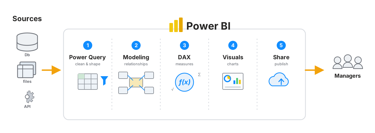
The five stages of Power BI. You build one per module across Days 2 and 3: Power Query (clean & shape — Modules 2 & 5) → Modeling (relationships — Module 6) → DAX (measures — Module 6) → Visuals (charts — Day 3 Module 1) → Share (publish — Day 3 Module 3). It starts by connecting to your Sources (Module 4) and ends with the report in front of Managers.
What Power BI actually is
Three products that share one name:
| Part | What it is | Cost |
|---|---|---|
| Power BI Desktop | A Windows application where you build reports | Free |
| Power BI Service | The website (app.powerbi.com) where you publish and share |
Free to publish; sharing needs a licence |
| Power BI Mobile | Phone and tablet apps for viewing | Free |
You build in Desktop, you share through the Service, people read on the web or Mobile. That is the whole workflow, and we cover publishing properly on Day 3.
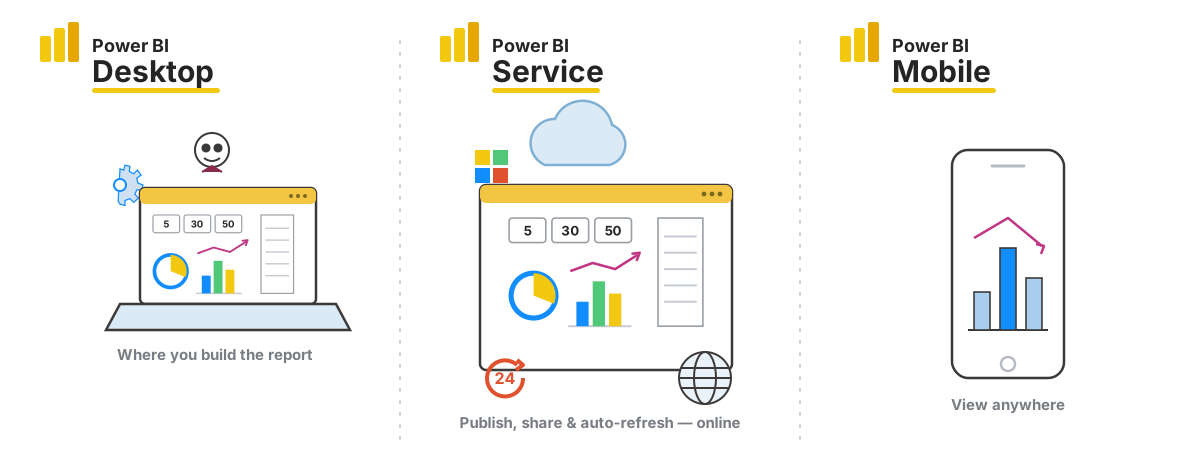
One report, three places: build it in Desktop → publish it to the Service (share it and let it refresh on a schedule) → read it on Mobile.
On a Mac? Power BI Desktop is Windows-only. Options: a Windows VM (Parallels/UTM), Windows on Boot Camp, a cloud PC, or use the Power BI Service’s browser-based editing — reduced, but enough to follow along. If none of these is available, work through the lesson by opening the provided
.pbixfiles on a colleague’s machine, and focus today on the Excel-side skills, which transfer directly.
The three views in Desktop
Down the left-hand edge:
| Icon | View | What you do there |
|---|---|---|
| Chart | Report | Build visuals — the design canvas |
| Grid | Table (Data) | Inspect the actual loaded rows |
| Diagram | Model | Manage relationships between tables |
You will spend most of your time in Report view, but Model view is where the real thinking happens (Module 6).
Those three views line up with the three layers your data passes through inside Desktop — and it all starts with Power Query importing and cleaning the messy source:
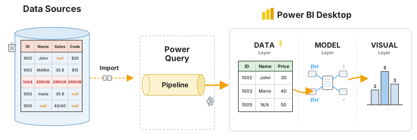
Left to right: raw Sources → Import → Power Query cleans them → the Data layer (the Table/Data view) holds the tidy tables → the Model layer (Model view) joins them and adds DAX → the Visual layer (Report view) draws the charts. Power Query is Module 5; Model & DAX are Module 6; Visuals are Day 3.
The screen in Report view
- Canvas (centre) — where visuals go
- Visualizations pane (right) — chart types on top, field wells beneath
- Data pane (far right) — your tables and columns
- Filters pane — filters at visual, page, or whole-report level
Getting data in
Home → Get Data. Excel, CSV, SQL Server, web, SharePoint, JSON, and hundreds more.
Two buttons appear after you choose a file:
- Load — take it as-is
- Transform Data — open Power Query Editor first
Choose Transform Data almost every time. It is the same Power Query Editor you used this morning — identical interface, identical Applied Steps panel, identical M language. Checking types and cleaning before loading saves a great deal of pain later.
That is the first big payoff of the morning: you already know how to use Power BI’s data-loading engine.
Building a visual
- Tick a field in the Data pane — Power BI guesses a visual
- Or click a visual type first, then drag fields into the wells beneath
- Change type any time by clicking a different icon; the fields stay put
The field wells vary by visual, but the pattern is constant:
| Well | Holds | Excel equivalent |
|---|---|---|
| Axis / Rows | What you’re grouping by | PivotTable Rows |
| Values | What’s being measured | PivotTable Values |
| Legend | What splits into colours | PivotTable Columns |
A Power BI visual is a PivotTable that draws itself. If you can build a PivotTable — and after Day 1 you can — you can build a Power BI visual. The four zones map almost one-to-one.
Aggregation
Drop a numeric field into Values and Power BI sums it by default. Click the dropdown on the field to switch to Average, Count, Minimum, Maximum, or Count (Distinct).
Numeric fields show a small Σ in the Data pane. If a number you expect to sum shows up as text instead, the data type is wrong — go back to Power Query.
Cross-filtering — the thing Excel cannot do
Click a bar in one chart. Every other visual on the page filters itself to match.
Click “Laptop” in a category chart and your map, your trend line and your KPI cards all instantly show laptops only. Click it again to clear.
Nobody sets this up. It works because the visuals share a data model, and it is the single feature that makes a Power BI report feel alive compared with a static Excel dashboard.
The core visuals
| Visual | Use for |
|---|---|
| Card | One big number — a KPI |
| Clustered column / bar | Comparing categories |
| Line | Change over time |
| Table / Matrix | Detail; Matrix ≈ a PivotTable |
| Map | Anything geographic |
| Slicer | On-canvas filter buttons — exactly the Excel slicer from Day 1 |
| Donut / Pie | Part-to-whole, sparingly |
Slicers
Insert a Slicer visual, drop a field into it, and you have clickable filter buttons — the same control, with the same name and behaviour, as the Excel slicer in Day 1 Module 8.
Ctrl + click selects multiple values. The Format pane switches a slicer between list, dropdown, and (for dates) a slider.
Saving
Power BI Desktop files are .pbix. One file holds the data, the model, the measures and the report layout together.
See it — worked example
Open My First Dashboard.pbix (download it from the link if you haven’t already).
It is built on the two CSVs in this folder — the same NovaTech Retail orders and customers you worked with all through Day 1. The data is familiar; only the tool is new.
Work through it in this order:
1. Table view. Inspect orders and customers. Check the data types on the column headers — dates as dates, sales as decimals.
2. Model view. There is a relationship between customers and orders on customer_id. Hover over the connecting line: 1 at the customers end, * at the orders end — one customer, many orders.
That line is doing the job of an XLOOKUP. It was drawn once, and now every visual can show customer attributes against order measures without a single formula. Compare that with copying a lookup down 20 rows in this morning’s advanced-formulas module.
3. Report view. Look at how each visual is put together — click one and watch the Visualizations pane show which field sits in which well.
4. Now interact. Click a single bar in the category chart. Every other visual re-filters. Click a country in the map — the same. Ctrl + click to select two categories at once. Click a blank part of the canvas to clear.
That interactivity is free. It arrives with the model.
Notes on the data
customers.csvis semicolon-delimited — Power Query usually detects this, but check the preview and set the delimiter if the columns arrive mashed togetherorder_dateis DD/MM/YYYY. If dates land wrong, set the type using Locale → English (United Kingdom)- Some customers have a blank score — normal, and worth noticing how Power BI handles blanks in aggregations
Two things happen to order_date
Drop order_date on a chart axis and it appears split into Year → Quarter → Month → Day. That is two separate mechanisms — don’t confuse them:
1. The type change — a real transformation. Turning the text 17/01/2026 into an actual Date is a Power Query step. To see it: Home → Transform data → select the orders query → read the Applied Steps panel on the right → the step is Changed Type with Locale. Turn on View → Formula Bar to see the exact code:
= Table.TransformColumnTypes(#"Promoted Headers", order_date, "en-GB")
The "en-GB" is the Locale — it’s what makes 17/01/2026 read as 17 January (DD/MM), not error as “month 17”. Click the ⚙ on the step to reopen its dialog.
2. The Year/Quarter/Month/Day split — automatic, not a step. You will not find this in Applied Steps. Once a column is a Date, Power BI silently builds a hidden date table and a drillable Date Hierarchy for it (the Auto date/time feature). See it in the visual’s field well: click the arrow beside order_date to expand the levels, and use the drill ▲ / ▼ buttons on the visual to move between Year, Quarter, Month and Day. The field’s dropdown in the well switches between the plain order_date and the Date Hierarchy. To turn the feature off everywhere: File → Options → Data Load → Auto date/time.
Do it — practice
Build your own version from scratch — the fastest way to make this stick.
- Open Power BI Desktop → Get Data → Text/CSV →
orders.csv→ Transform Data - Check every column’s data type; fix
order_dateif needed (Locale: UK) - Close & Apply
- Repeat for
customers.csv(watch the semicolon delimiter) - Model view: drag
customer_idfromcustomerstocustomer_idonorders. Confirm it reads 1-to-many - Report view — build five visuals:
- A Card showing total
sales - A Card showing count of
order_id - A Clustered column chart:
product_categoryon Axis,salesin Values - A Line chart:
order_dateon Axis,salesin Values - A Map:
countryon Location,salesin Size
- A Card showing total
- Add a Slicer on
product_category - Give every visual a real title (Format pane → General → Title)
- Test the cross-filtering — click a bar and watch everything respond
- Save as
.pbix
Check yourself: compare against My First Dashboard.pbix. Your totals should match; your layout will differ, and that’s fine.
If you get stuck
| Problem | Why | Fix |
|---|---|---|
| Columns all in one column | Wrong delimiter | Re-import; set delimiter to semicolon |
| Dates wrong or erroring | DD/MM/YYYY read as US format | Data Type → Date → Using Locale → English (UK) |
| Sales won’t sum | Loaded as text | Change type to Decimal Number in Power Query |
| Visuals don’t cross-filter | No relationship | Model view — create it |
| Map shows nothing | Location not recognised | Set the field’s Data Category to Country |
| Numbers far too high | A many-to-many relationship, or a duplicated key | Check the relationship cardinality |
Check your understanding
- What are Desktop, Service and Mobile each for?
- Why choose Transform Data over Load?
- How do a Power BI visual’s field wells map to a PivotTable’s four zones?
- What does cross-filtering do, and how much setup does it need?
- A relationship between two tables replaces which Excel formula from Module 1?
- What does the
1and*on a relationship line mean?
Previous: Module 2 · Next: Module 4 — Connecting to Different Data Sources · Day 2 index: README
© 2026 Global Academy. Prepared for the ZIMASCO (Kwekwe) workshop. Facilitated by Tapiwa Zireva. Licensed to participants for personal learning — not for redistribution, resale, or reuse in other training without permission.